Why are public sector logos (and, by extension, their brands), so awful? The latest Brand Soup blog compares the likes of the Government’s Gangmasters Licensing Authority, Vehicle and Operator Services Agency and Health & Safety Executive with private firms’ logos – and finds them sadly lacking.
What should the pen pushers in Whitehall – and the branding agencies that take taxpayers’ m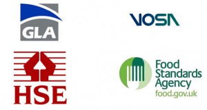 oney to come up with these dire designs – do? To tuck into Brand Soup’s suggestions go here
Pictured: The good (Food Standards Agency), the bad (GLA) and the ugly (HSE)


