UWE Bristol has unveiled a new brand and visual identity – the first change since it became a university in 1992.
The university, which has around 27,000 students and more than 3,500 staff, tapped into Bristol’s design, marketing and branding expertise on its doorstep for the new identity, below.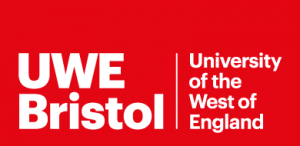
It worked with city-based digital and design agencies Bray Leino Yucca – whose clients include Bath Spa University, Bristol-headquartered law firm TLT and Clark’s shoes – digital agency Activation – with clients such as Nestle, Pieminister and Bristol Sport – and Gibe – which counts Felix cat food, Island Bathrooms and Amit Wines among its clients.
Gibe co-founders Pete Williams and Steve Temple first met at UWE in 1997.
The agencies helped developed the project for UWE, giving what the university describes as “a confident new brand that will strengthen the university’s profile and boost pride in students, staff and alumni”.
“The new identity ensures UWE Bristol and all the fantastic opportunities and experiences it offers are presented to students and other audiences in a way that resonates with them,” it added.
“UWE Bristol is an exciting, vibrant and successful institution, and the new identity will reflect this by ca pturing the excitement and values of the University as well as its strengths and ambition.”
UWE has had the same identity since 1992, right, but is now a far different organisation to the one that emerged from the former Bristol Polytechnic. It has grown rapidly to become one of the leading universities in the South West.
It said its new brand would support its strategic direction and help potential students and audiences gain a clearer understanding of what it had to offer.
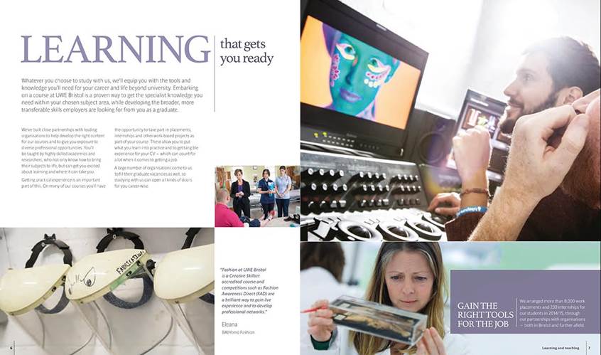
The visual identity features a new font, logo, colour palette and imagery style, alongside a new way of presenting key messages and writing about the university. 
The has the flexibility to work across a number of applications and channels, from print to digital, pictured right and below, and has been designed to appeal to diverse audiences from undergraduates to businesses, while retaining a cohesive feel.
Extensive research was carried out in the development phase among prospective students, current students and alumni, teachers, advisers and parents, 1,200 businesses and employers, as well as current staff to gain valuable insight into their perceptions of the university.
Red has been retained as a main colour in the logo as it was felt to be synonymous with the institution but a “flexible and vibrant palette” is also being used.
Changes will be rolled out across the university over the next 18 months and to keep costs to a minimum items will only be updated in the new style at their natural replacement point.
Vice-chancellor Steve West said: “We’re an ambitious university, with exciting developments underway and in the pipeline, and plenty to shout about, in terms of the quality of our teaching, research and student experience.
“Our new brand is designed to reflect those things fully and really bring to the fore what people like about working and studying with us.”
The university’s ambition, captured in the 2020 strategy, is “To be a university recognised for the success and impact of our professionally recognised and practice-oriented programmes; our strong industry networks and connections; our agile ways of working; and our inclusive and global outlook and approach”.


